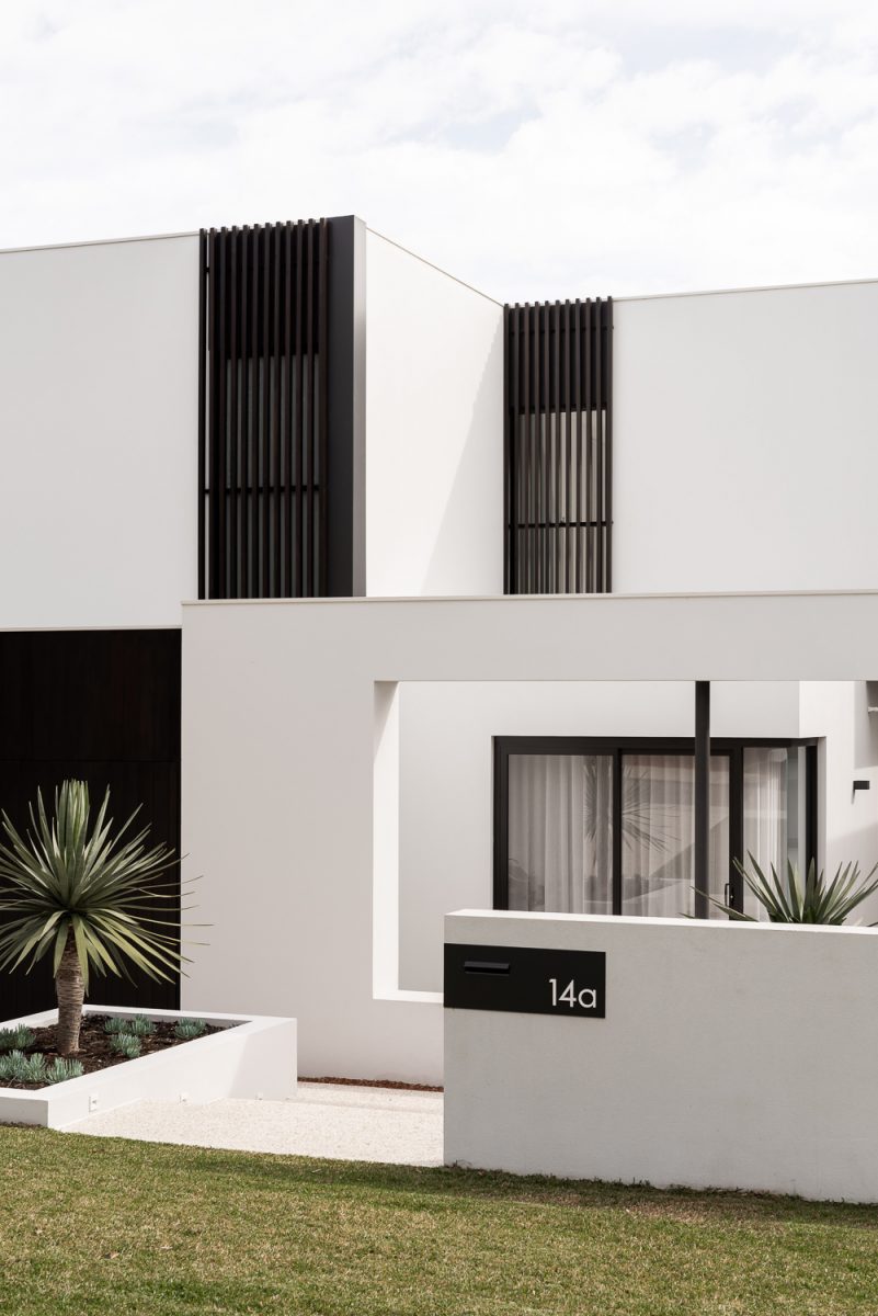
Where function, clean forms, efficient planning, and a whole lot of storage are the order of the day. A family sanctuary where the garden and its connection to the most used spaces of the home take precedence over designing around a view.

MOUNT PLEASANT HOUSE
2019
LOCATION: Mount Pleasant
BUILDER: Formview Building
ENGINEER: Andreotta Cardenosa Consulting Architects
ENERGY CONSULTANT: Natalie Stark
MURAL ARTIST: Bel, the artistic owner!
PHOTOGRAPHY: Dion Robeson
STYLIST: Anna Flanders
LOT SIZE: 507m2
HOUSE SIZE: 245m2
ZONING: R20
It is a common request from clients to orientate the design toward a view, if there is indeed a view to be had. The term ‘view’ in the context of Perth generally means glimpses of the city skyline, the river, or the ocean. In many cases, we believe a view is overrated. Do we sit and stare at the view? Perhaps what we really crave is the feeling of being in a certain place, smelling the sea or feeling a cooling breeze. Sensory sensations that locate us in whatever location we happen to be. For this home, the owners agreed that we dismiss the idea of an ‘upside down’ house in order to capture city views from the living areas, in favour of a ground floor living that has strong connections to the garden.
A home for a growing young family, one in which they can enjoy and grow into for years to come. The program includes four bedrooms, two bathrooms, and a spacious living and outdoor dining area. With an advantageous northern block orientation, we hinged the design decisions around making the most of it, to create thermally comfortable and functional living areas. The living space comprising kitchen, dining and lounge is rectangular in form and runs in a north-south orientation with the length of the block. Pushed to the west, it allowed for an eastern courtyard that opens to the kitchen allowing morning sun to flow through. Dividing this courtyard and the garden is a covered outdoor dining room, having the dual aspect of both green spaces. The first floor houses the parents’ bedroom and ensuite, separated from the rest of the house that also grabs those city views, best seen at night.
When it comes to building forms, there are two at play in this home. From the street, rectilinear forms dominate, a modern and simple composition with minimal openings for privacy. These forms hide the dramatically pitched roof of the rear living areas, pitched to pull northern light into the home. We did not design any upper floor building over this living space, allowing us to have these soaring high ceilings and still adhere to council height limits. The two-storey portion of this home is entirely located to the street side, with the remainder of the home being single storey.
The size of a project directly influences the cost. The cleverer you can be with the layout and the more flexible a space is, the less space you need. With this project, we had to look for ways to shave-off building area to hit the budget, along with meeting the family’s brief. Considering this, we decided that bedrooms should be used for more than just sleeping, why can’t they be used for play also!? While the idea of a dedicated ‘games room’ is appealing to keep kiddie mess contained, we would rather prioritise the quality of a space rather than quantity, especially when working within scope constraints. A concealed cavity sliding ‘wall’ between the two children’s bedrooms was created so they could open the rooms up to each other forming one large play space. As the children grow older, they can opt to lock or make this sliding wall permanent to create two separate rooms. From all reports so far, the kid’s in this household refuse to close the wall at all, loving the fact they can all sleep in the same room!