URBAN HOUSE
2017
LOCATION: Perth
BUILDER: BE Projects
ENGINEER: Andreotta Cardenosa Consulting Engineers
ENERGY CONSULTANT: The Study
BUILDING SURVEYOR: Resolve Group
LANDSCAPE ARCHITECT: TDL – Tristan Peirce
PHOTOGRAPHY: Dion Robeson
AWARDS
Australian House & Garden Top 50 Rooms Australia 2018
LOT SIZE: 422m2
HOUSE SIZE: 370m2
ZONING: MIXED USE R20
THE BRIEF
The goal was to create a low maintenance, minimal home for a young family with two dogs. Interiors were to be kept open and flexible, and orientated toward the northern aspect and pool. The program incorporated four bedrooms, three bathrooms, library, double garage, laundry, wine cellar and a large, open-plan living space. The brief also required the architect to utilise the mixed-use zoning of the site by incorporating a commercial tenancy into the home which was to be leased out in the short-term, but used as the client’s home office in the future.
DESIGN SOLUTION
The design and interiors had to be adaptable for the family’s needs now and in the future.
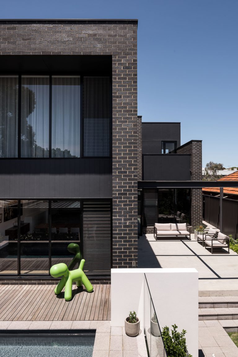
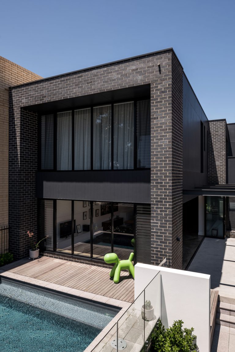
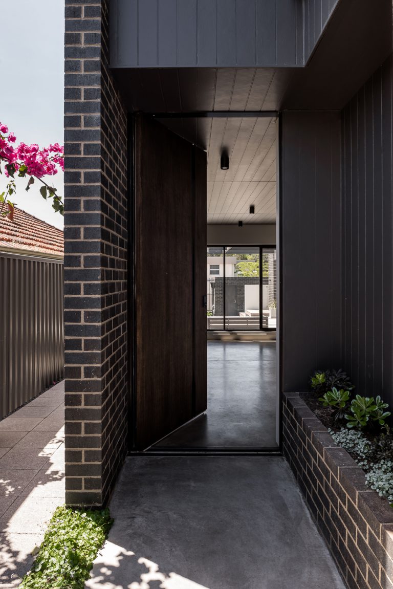
The self-contained commercial space was incorporated into the building at street level, with the residential component hidden above and behind. These two zones are completely autonomous, with separate entrances, thick walls and extra insulation for privacy.
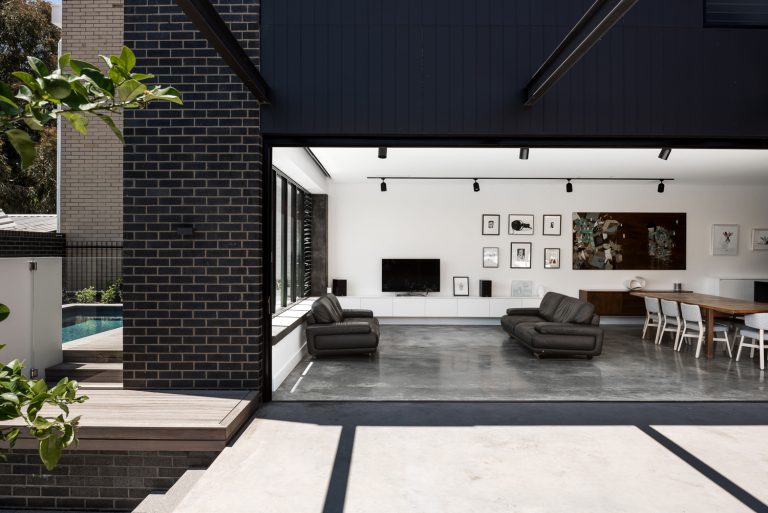
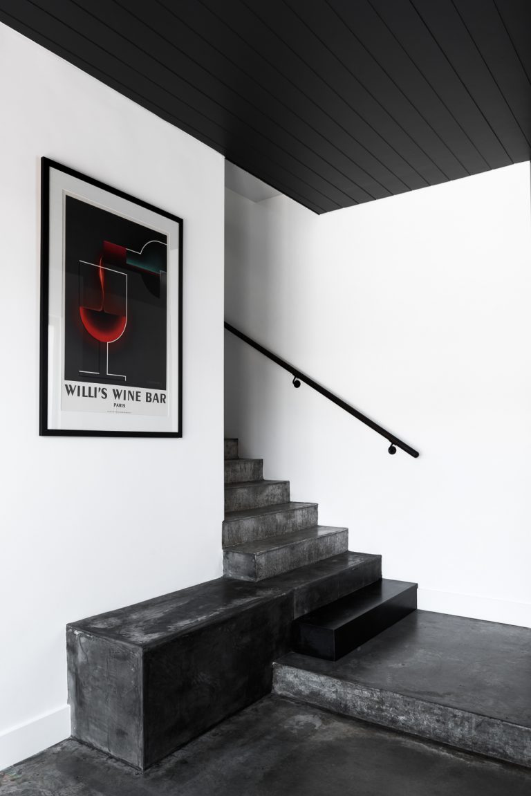
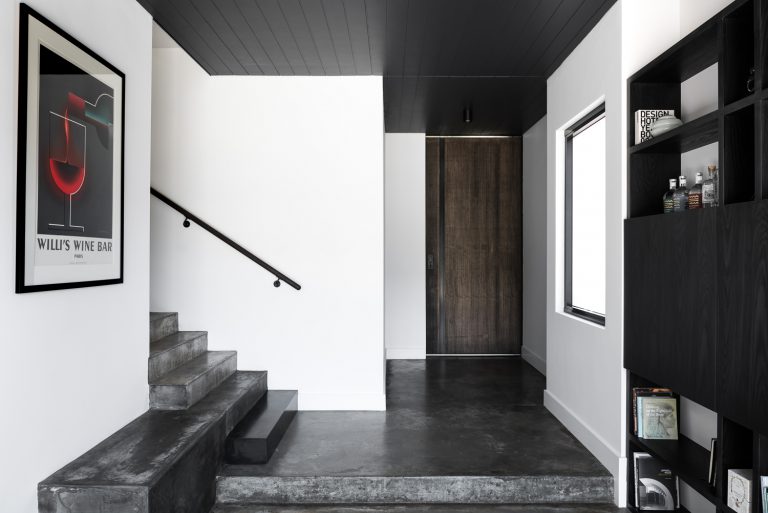
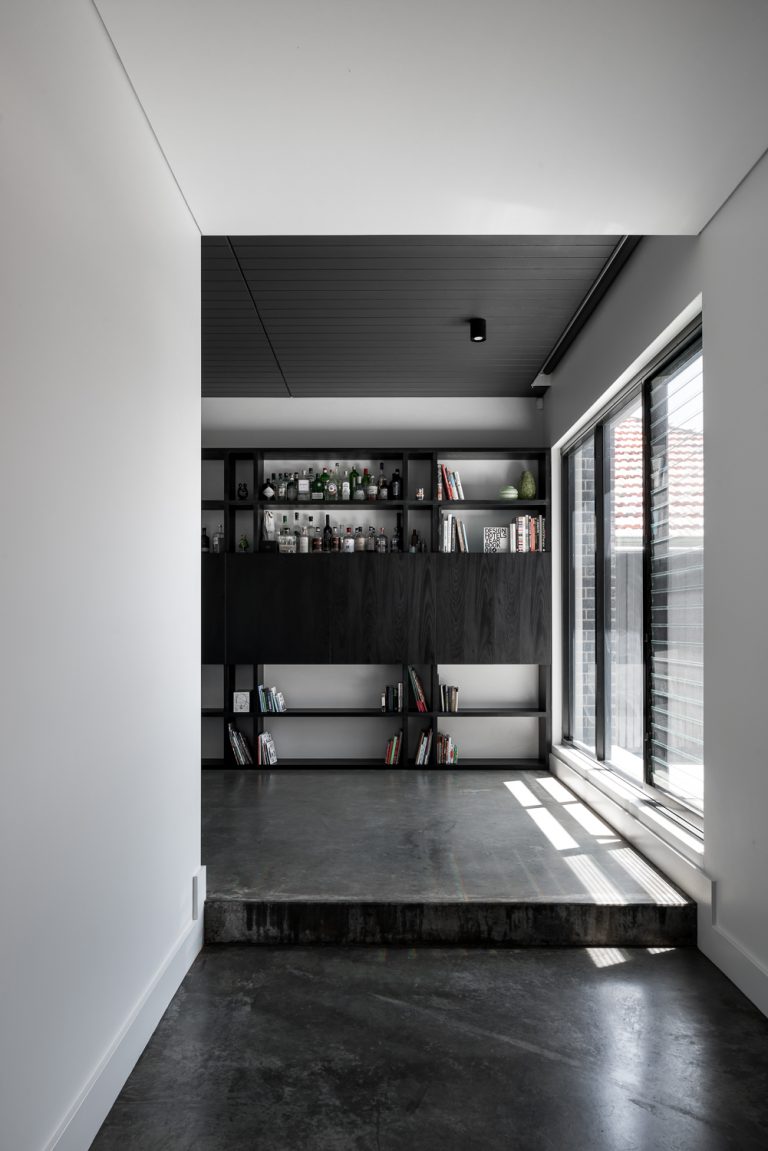
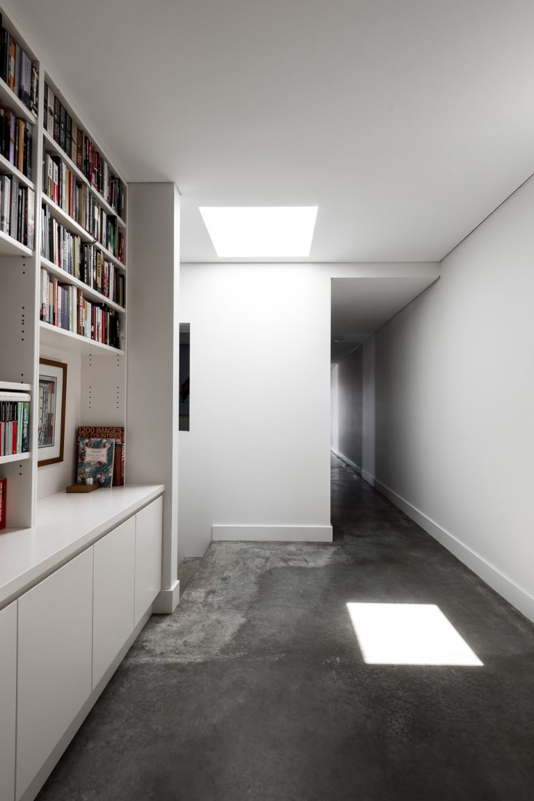
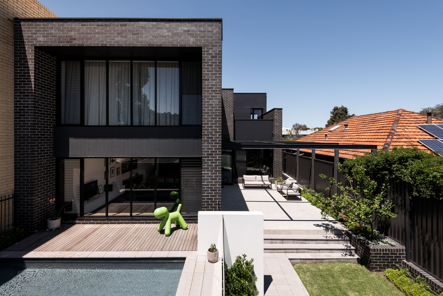
Within the home, ceiling height variations and materials define the various living zones. In the entry and library, for example, the same charcoal cladding from the exterior of the home was used on the ceiling to compress these spaces and creating a cosy, dramatic feel. As you move into the open-plan living room, the ceiling jumps up to provide a sense of openness and generosity.
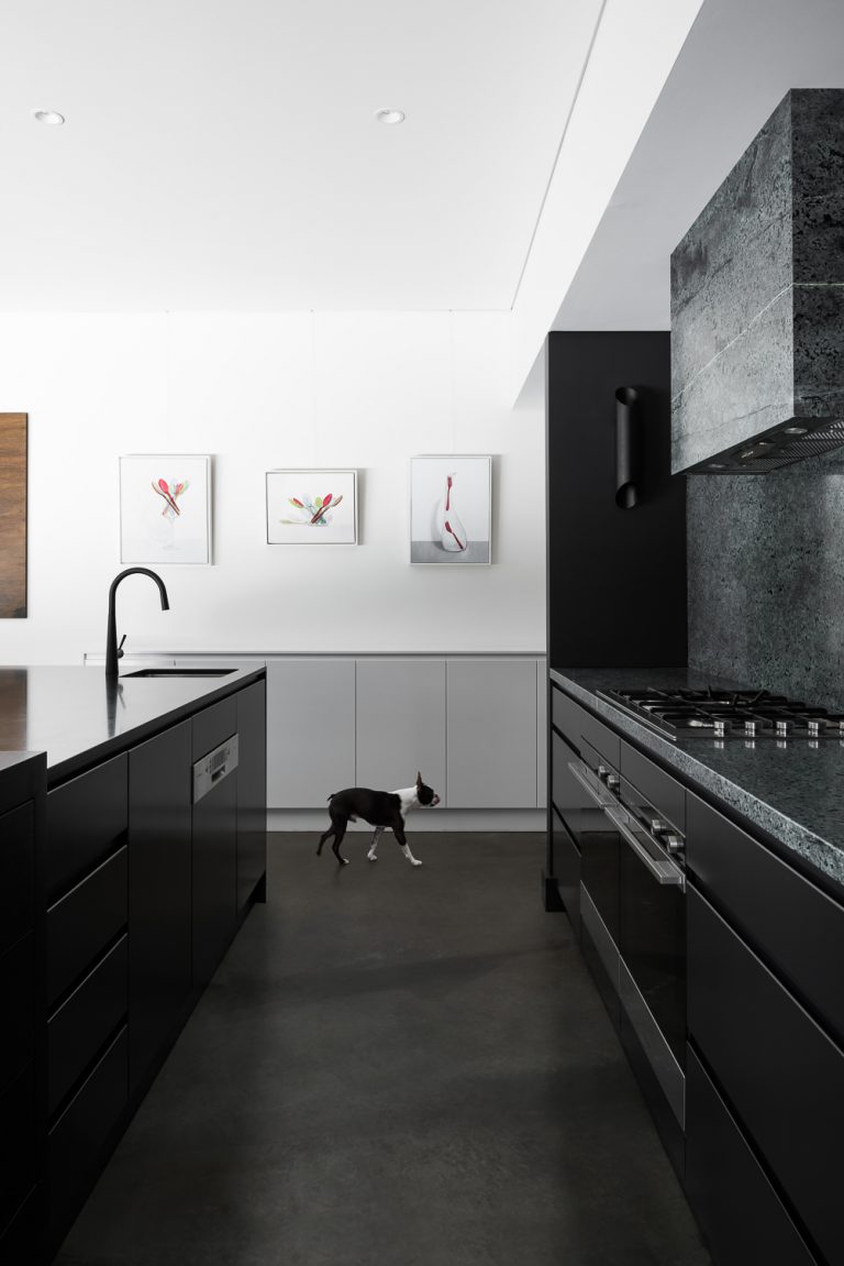
Utilitarian areas, such as the food prep zones and scullery sink in the kitchen, are hidden from view when in the living and entertaining spaces. Another key consideration was to make high-use areas easy to access and hardwearing.
STREET SENSE
At street level, the home sits opposite a strip of shops on a busy road – a zone where properties transition from commercial to residential. In accordance with this, the scale, height and openings on the ground floor are aligned with the commercial property to the east, while the western half of the building has been set back to match the single-storey neighbouring dwelling. The design and materials visible from the street create a slight sense of ambiguity about the building’s function, which was intentional given its mixed-use nature.
FLOW MOTION
Japanese influences are expressed through colour and texture such as matte finishes and richly coloured accents. The interior had to be timeless also have the potential to be transformed over time by different users with furnishings.
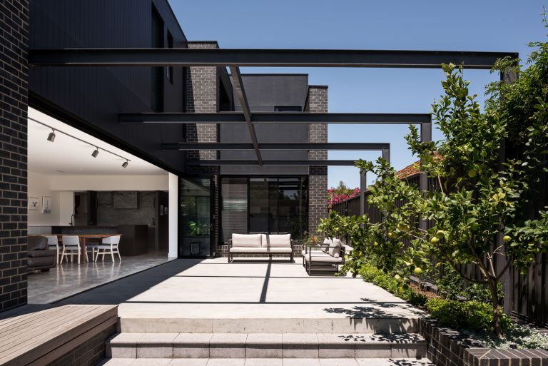
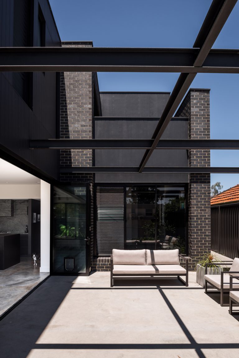
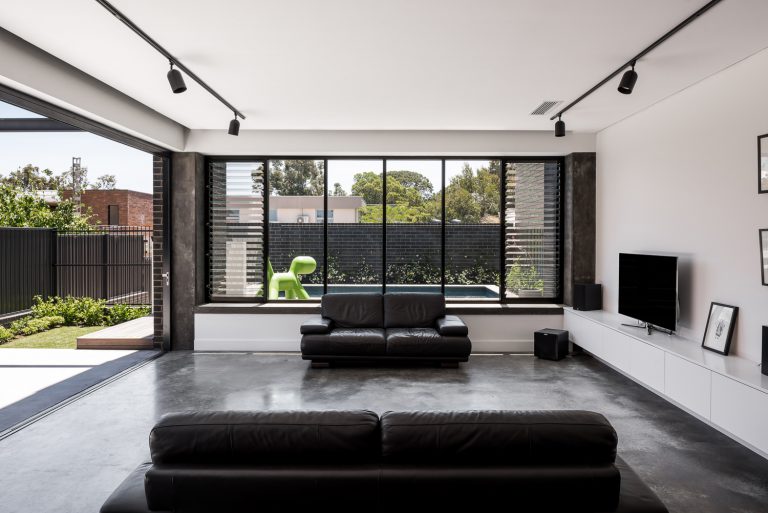
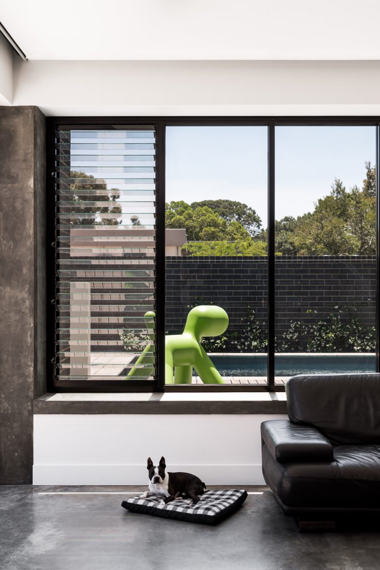
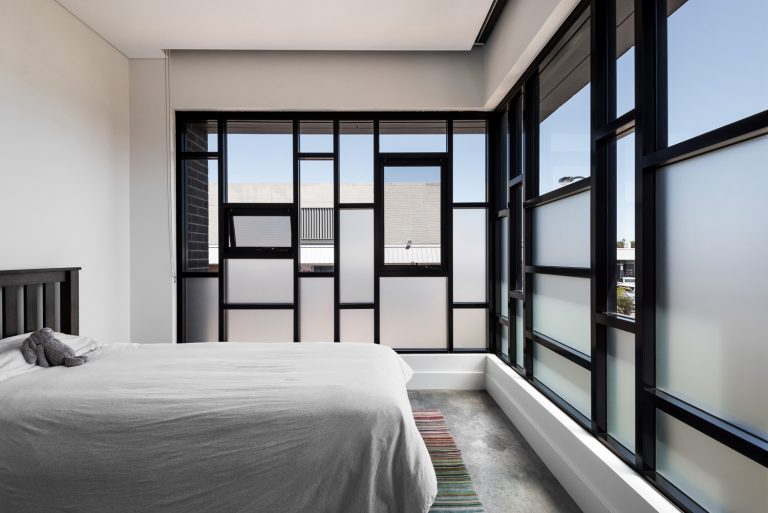
Level thresholds between the courtyard and living wing, and a uniform floor finish, create flow and one large indoor/outdoor space to host parties. Leafy views out to the park in the north are capitalised upon wherever possible through full-height, shaded glazing.
Burnished concrete floors, black-timber-lined feature ceilings, clean white walls and dark veneer all lend a sleek tone to the interiors. The dark ceilings of the entry and library are a continuation of the external black cladding that wraps around the exterior of the building.
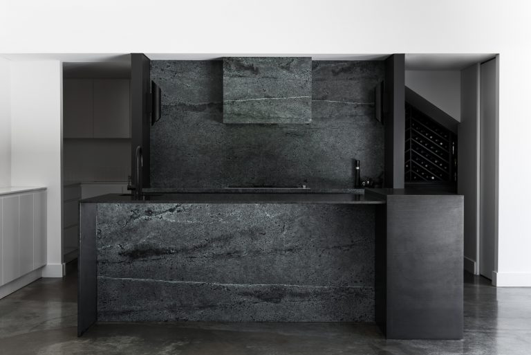
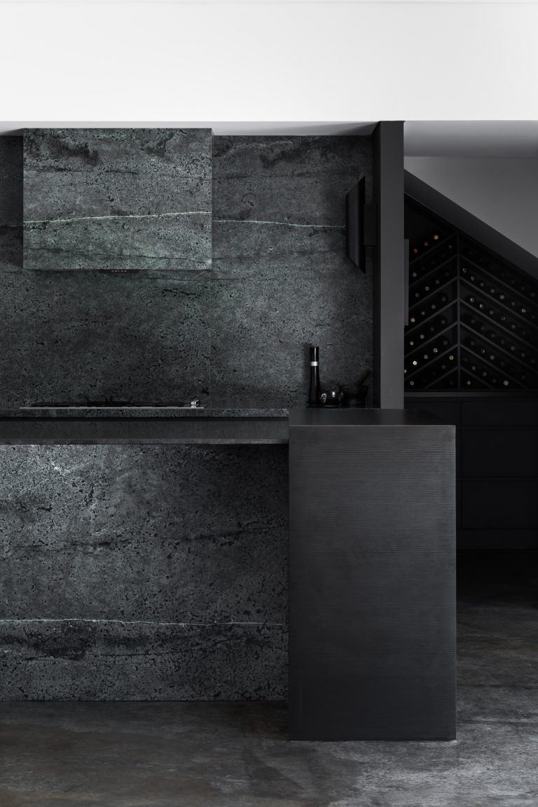
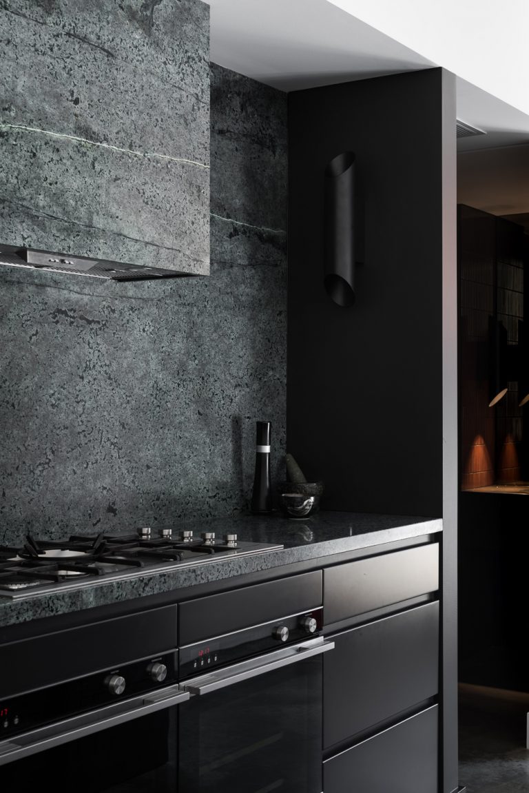
The jade-green Celedon quartz used in the kitchen was handpicked by the architect at the stone yard and carefully detailed to ensure the veining aligned as it crosses the rangehood and extends onto the splashback. The island bench was made with Zimbabwe Black honed granite which blends into its surrounds, allowing the green quartz to be the star. Scullery areas are concealed and custom cabinetry display the wine collection.
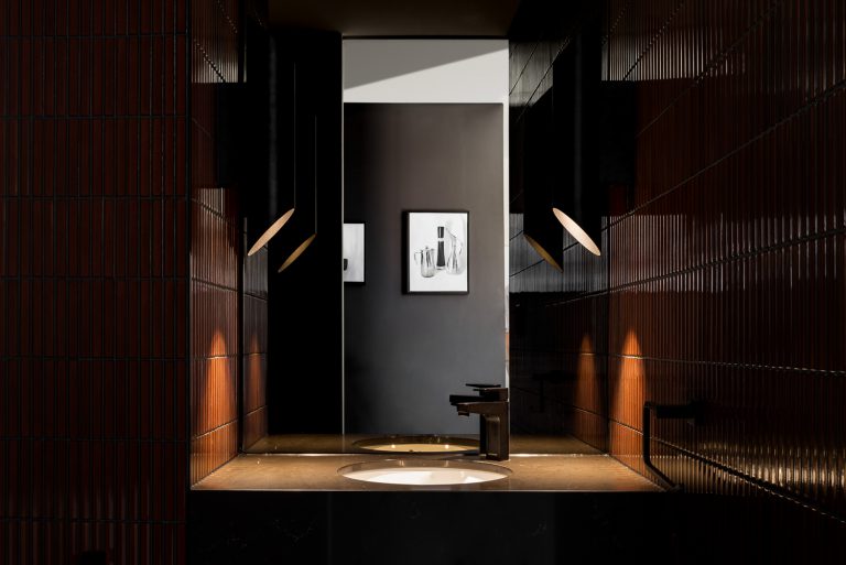
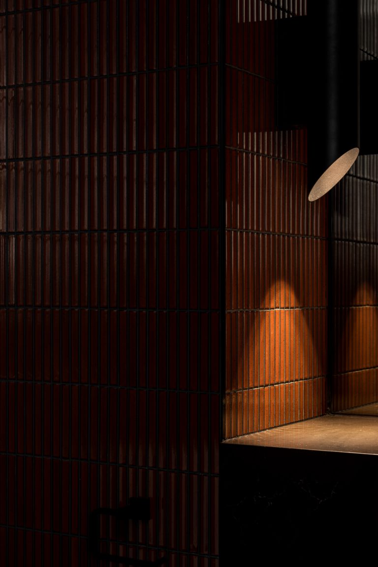
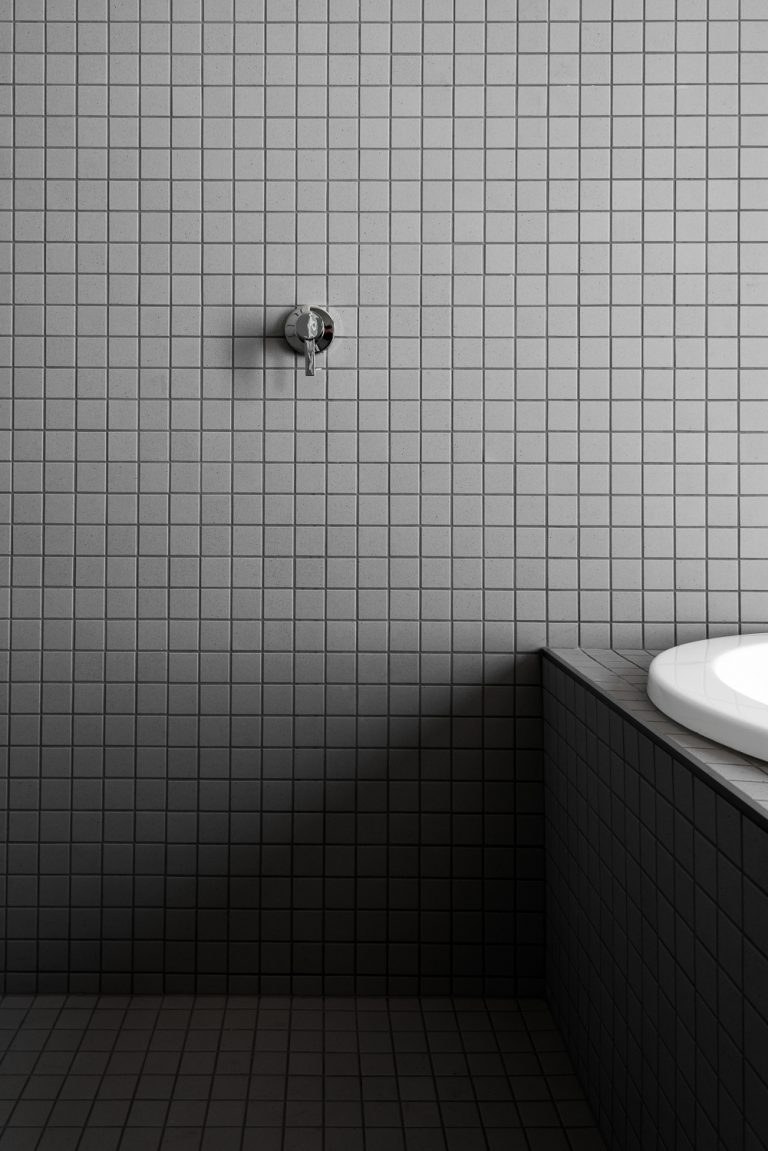
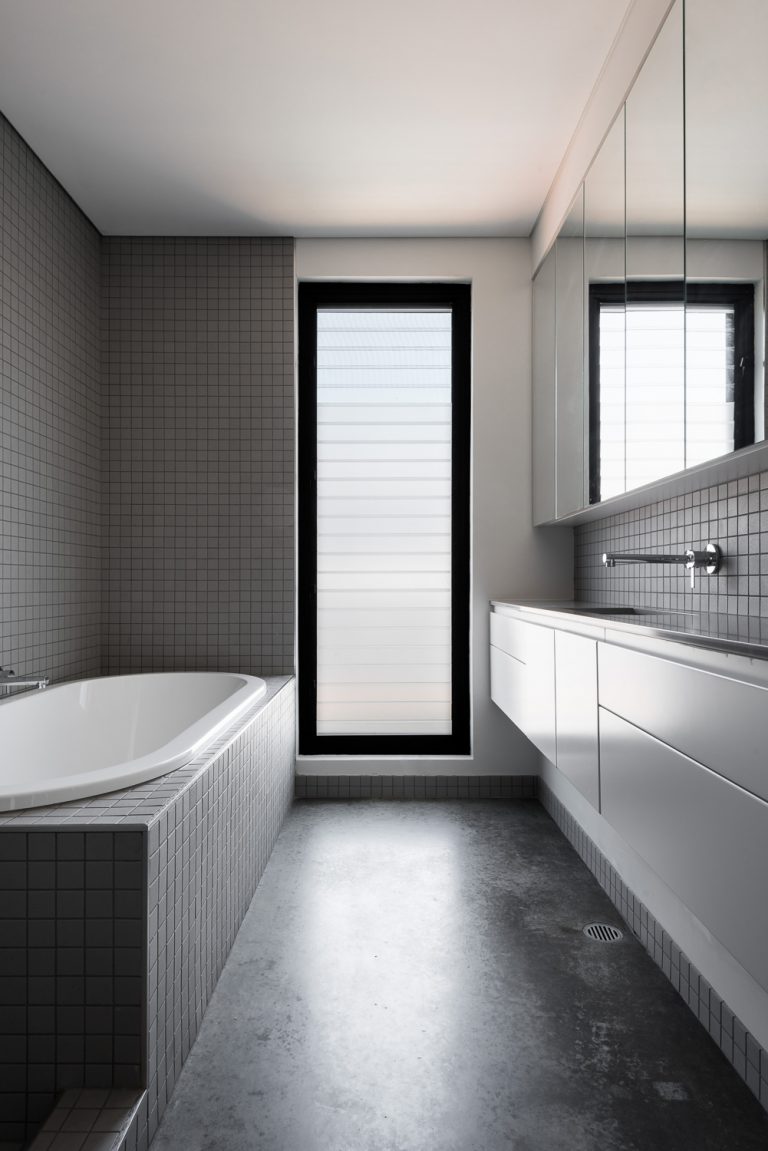
Bathrooms feature Artedomus Japanese tiles in tones of charcoal and grey and are repeated on both walls and floors to convey a sense of calm. The monochromatic theme carries through to the guest powder room, only with a much bolder burnt-red tile that lends some drama.
SUSTAINABILITY
As should be the case with all high-quality architecture, sustainability was ensured by adhering to sound passive design principles. Northern shading, cross-ventilation and opening types were designed to be energy efficient whilst still maintaining desired outlooks.
FUN FACT
- The quartz stone used in the kitchen had been sitting in the factory for a while as the colouring made it an unusual choice. However, the material suited the palate perfectly and has lent the room a moody quality.