The Tree House
2023
LOCATION: Mount Lawley, Perth
BUILDER: Red Cloud
ENERGY CONSULTANT: The Study
PHOTOGRAPHY: Dion Robeson
LOT SIZE: 245m2
EXISTING GROUND FLOOR: 67m2
EXTENSION AREA: 122m2
ZONING: R40
USING EVERY INCH OF SPACE
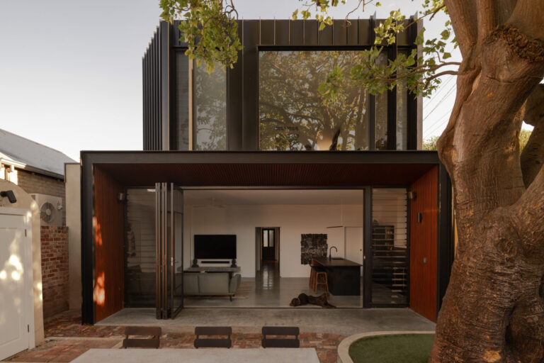
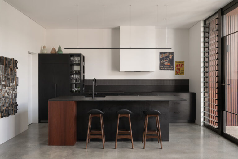
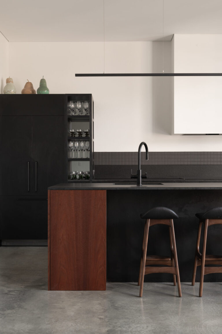
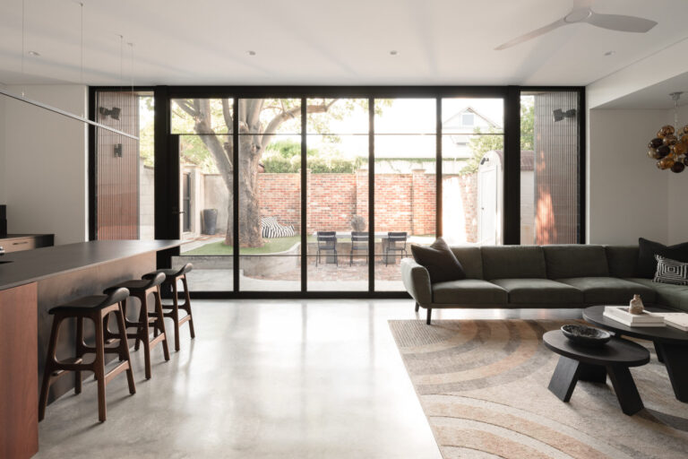
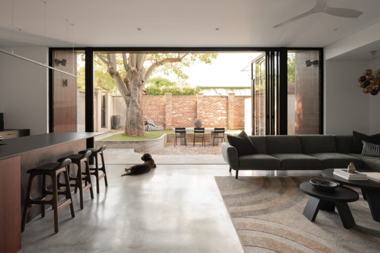
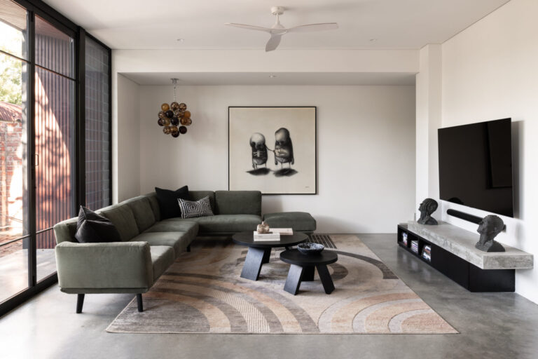
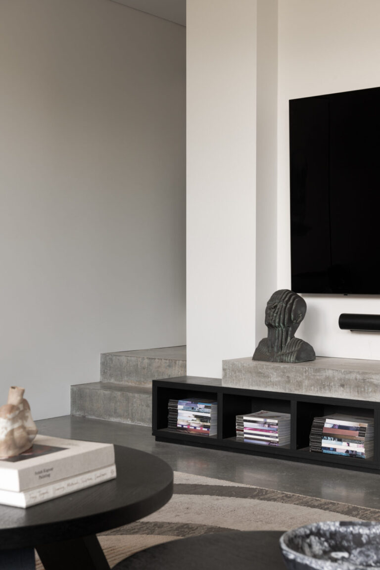
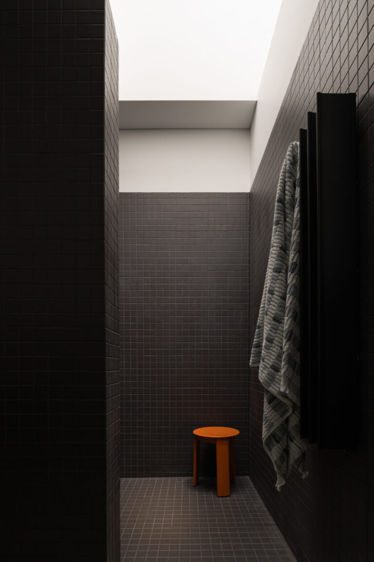
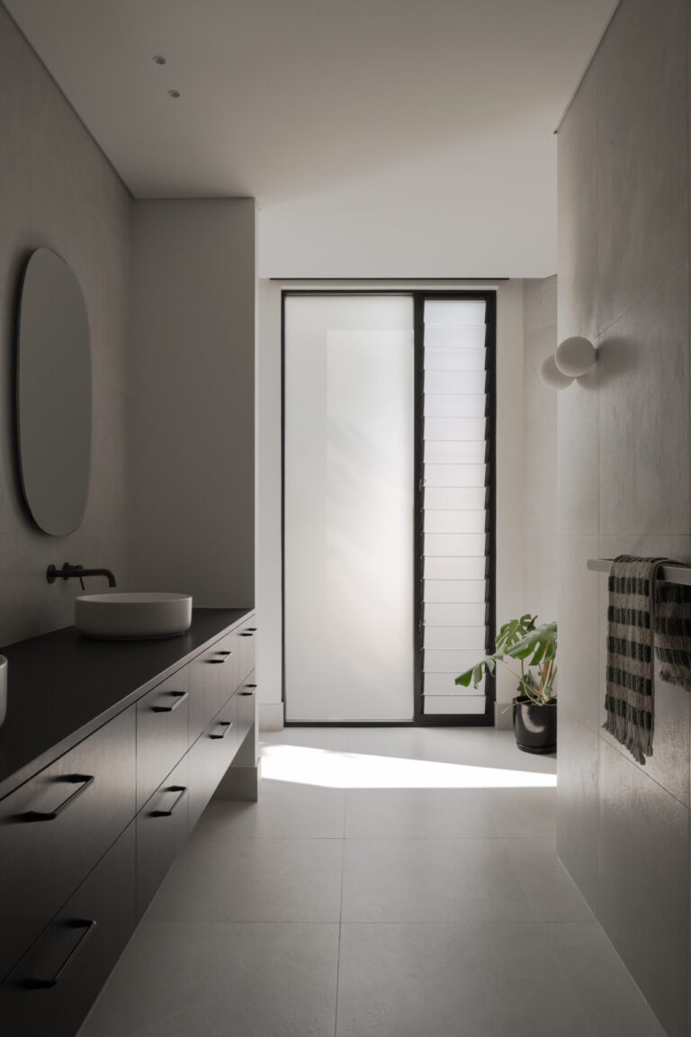
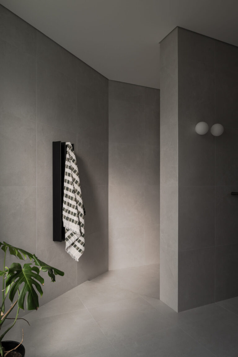
The new ground floor living space was designed to maximise efficiency and storage for the family, orientated towards the north and views of the tree. The kitchen island bench works overtime as both a prep area and a dining table, with stools on two sides. This allows more area given over to the lounge room, where the owners can choose to add a dining table, or simply leave more space around their sofa and armchairs. The design priorities how the family of three live 90% of the time, and not for those times when entertaining more guests (although the enormous bi-fold doors open-up to create one large indoor-outdoor party zone). A new bathroom and separate toilet replaced the existing kitchen, utilising the existing skylight for natural light. Tucked below the new staircase, is the small but efficient laundry and walk-in pantry.
BEDROOM AS TREE HOUSE
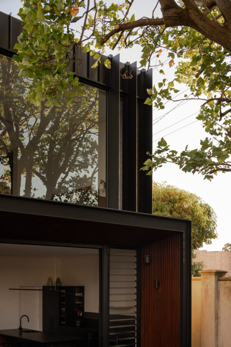
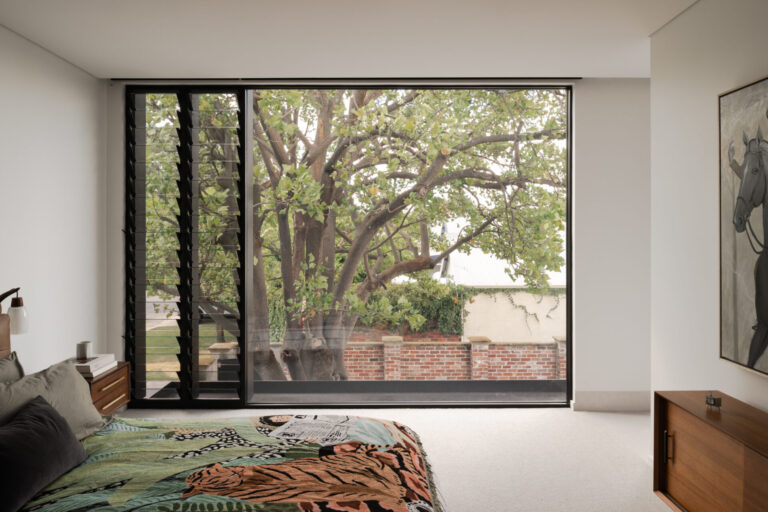
A new upper floor containing the master bedroom, walk-in robe and ensuite sits neatly over the living areas below. Expansive north-facing glass to the bedroom places the owners right amongst the verdant canopy of the existing tree, a private and delightful sight to wake up to every morning! Strategically placed vertical fins to this glazing prevent overlooking and views from passer-byers into the bedroom. The raised walk-in robe (to preserve the ornate pressed-tin ceiling of the bedroom below) allows for city views through the chimney and roof of the original shop front below.
PASSIVE DESIGN, AS USUAL
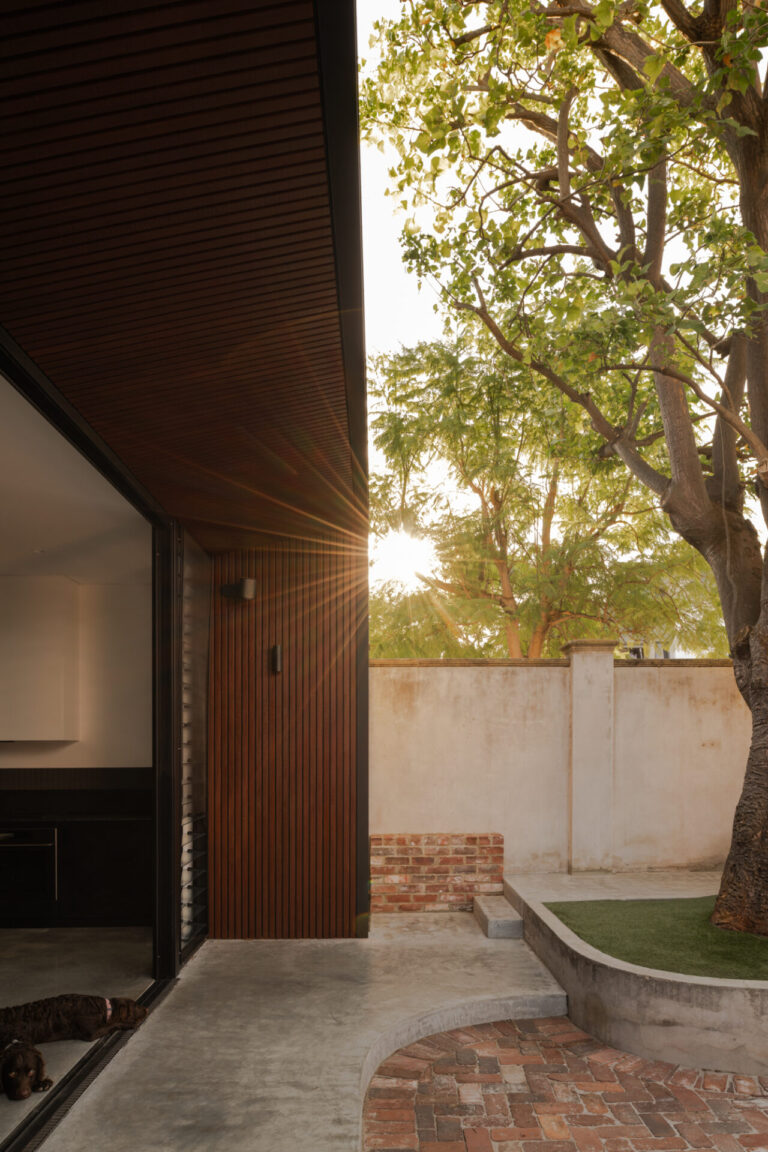
On both levels, the north façade features full-height glass to maximise the northern light entering the home in winter. However, in summer the large deciduous tree does the heavy lifting, shading the glass from the hot Perth sun. Strategically placed louvred windows allow for the south-wester to push hot air out of the home in the afternoons, and the concrete slab-on-ground acts as thermal mass.
THE CORNER STORE IS STILL THE STAR
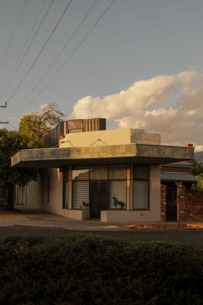
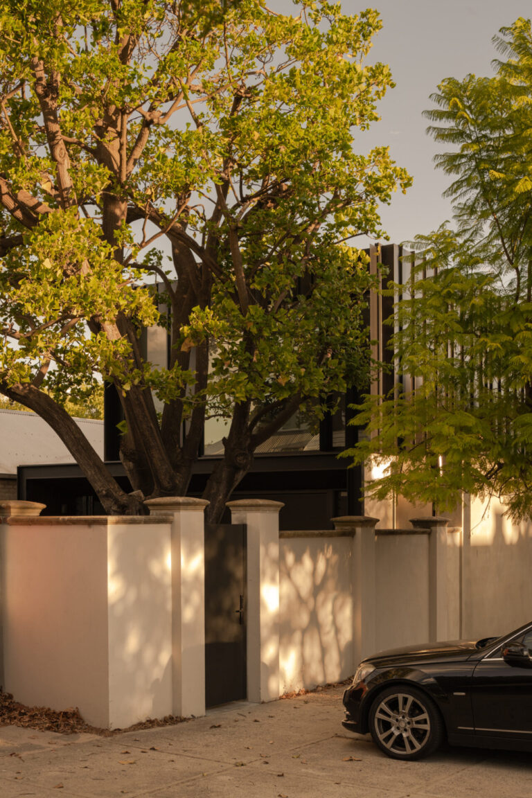
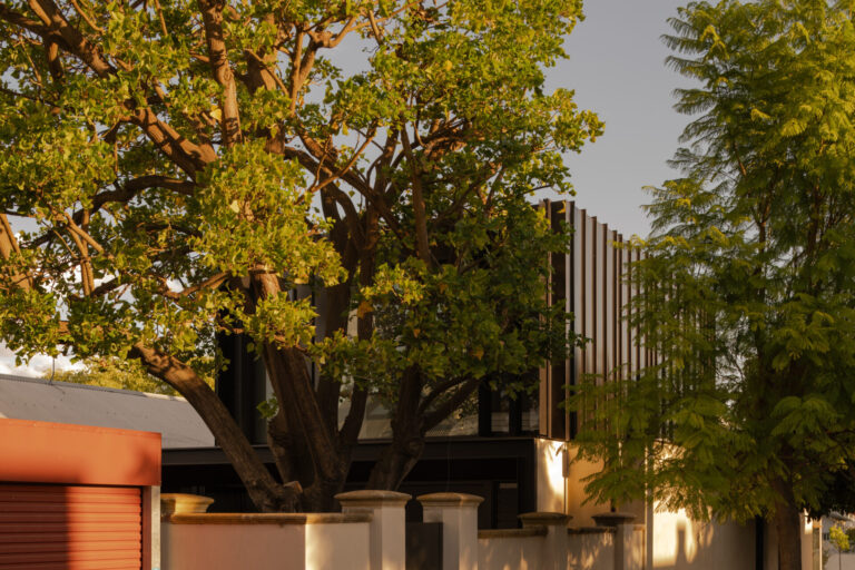
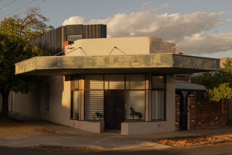
When viewed from the street, the new building additions are predominantly concealed by street trees and the large backyard tree. The additions are designed to be discreet, modest, and keep the focus on the charming original shop front. Black metal cladding was selected to clad the upper floor walls, so it recedes into the background and doesn’t compete with the existing heritage façade. The vertical pan widths of this cladding adds a subtle detail and helps to break up the bulk visually. The upper floor roof is spliced at the same angle as the existing roof, thereby reading as an extension of the existing roof. It is a quiet addition that is happy to play second fiddle to what is already there.
MATERIALS
Jarrah timber battens line the raked eaves to the new living wing. Jarrah was selected to add warmth to a paired back internal material palette of burnished concrete floors, black timber cabinetry and clean white walls. The jarrah eaves reference the existing jarrah floorboards to the original house. Existing brick pavers were recycled and utilised as the flooring for the outdoor dining. The tree canopy was used as shading for the outdoor dining, instead of building a permanent cover structure.
SPACIAL TRICKERY
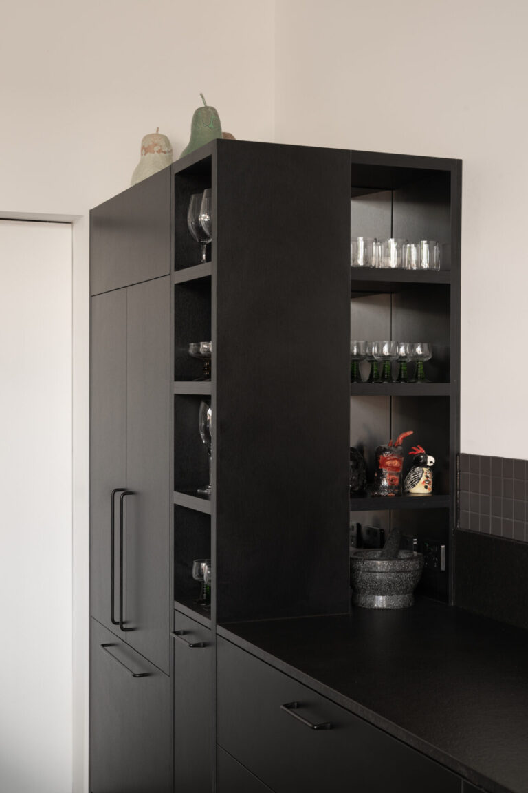
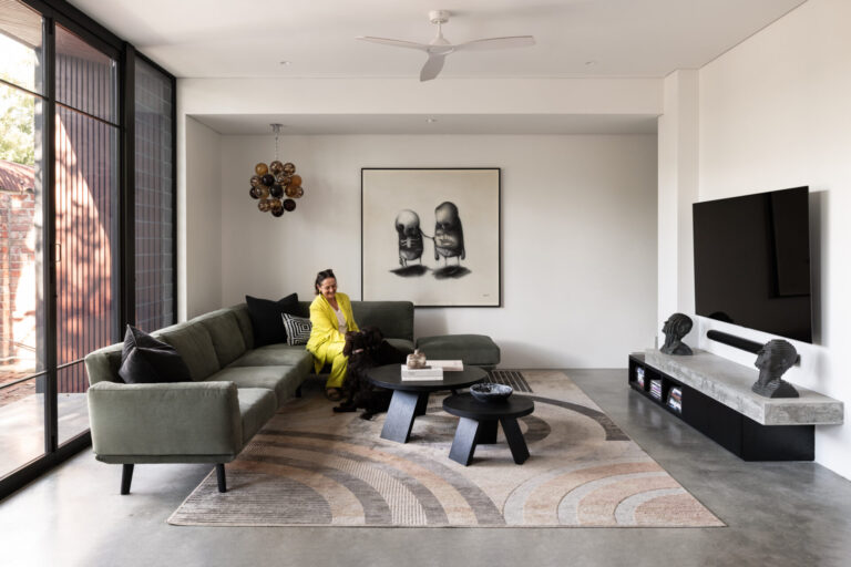
Working with a small footprint, we used subtle architectural details to enhance the sense of space, and to ensure the new extension felt larger than the one it was replacing. Cabinetry was intentionally kept short from the ceiling to make the ceilings feel taller, and so you read the full width of the room. Mirrors were also utilised in the open cabinetry to enhance the sense of space. Extending the internal concrete finish externally, ensures the ground floor living space feels much larger than it is. The full-width bi-fold doors in this living area enable the entire room to open to the garden, to play host to many parties in all weather.
ART…
The owners existing art collection had a large influence on the design of the home. The kitchen rangehood cladding intentionally matched the walls to allow the owners colourful and personally significant pieces to be the feature. Walls were sized to accommodate specific pieces. The external boundary wall was designed to host a large street-art mural, referencing the owners tiger statue that sits in the shop front window that has become renowned amongst the neighbourhood children. The design is only complete through installation of these art pieces. The architectural and in-built items don’t need to be ‘complete’ for the sake of a great photo, good design should allow the owners personality and objects to shine and complete the picture.
